COON

Yoga Eight
Class Scheduling and Membership Tool
Universal accessibility is the key ingredient to getting your customers to you consistently and continuously, especially when your product is yoga and for most, a luxury that must be squeezed into a busy schedule. There are enough barriers in life; your product’s digital doorway shouldn’t be one of them. This responsive web tool allows people to view schedules, book classes, and manage their account on any device, in any environment they may be traversing, as they bend over backwards to get to your studio.

Empathize • Define • Ideate • Prototype • Test

01
Project Overview
Yoga Eight yoga is a chain of local studios with online classes available to users as well. The typical user is between 24 – 45 years old and most users are urban professionals. Yoga Eight’s website goal is to provide an easy way to search, access, schedule classes and maintenance your account.
Project Duration:
September 2022 to October 2022
Role:
UX & Product Designer
Platform:
Responsive Website
The Problem:
Fitting a class into your busy schedule is hard. Popular classes fill up quickly and managing your account requires standing in long lines before classes when all you want to do is get onto your mat and find some zen.
Tools:
Adobe CC (Xd, Ps, Ai, Ru)
The Goal:
Design a website that users can easily view class schedules, book classes, and mange payment and membership options.
02
Empathize and Define
I conducted user interviews, which I then turned into personas and journey maps to better understand the target user and their needs. I discovered that many are frustrated with the process barriers of getting into a class. These included having easy access to an accurate, up-to-date schedule, the class reservation process and managing their payment account. Many studio websites are overwhelming and confusing to navigate, which frustrated many target users. This causes an additional hurdle to getting into class and accomplishing their goals, while also reducing the positive impact of the class and practice.
User Group 1:
Working adults on a tight schedule who are trying to efficiently maneuver their schedule around the schedule of the yoga studio.
These users:
-
Tend to be residents in the area who vary in age and occupation.
-
They are familiar with technology, understand apps of this nature, and have preset expectations.
-
Would use a website to manage their membership check the schedule, sign-up for classes, and check for cancellations.


Research Insights
Pain Points
1
Ease of Use
Studio website is difficult to navigate to and is often not up-to-date.
2
Reservations
Getting to class and not having a spot available because you were unable to easily access a reservation system.
3
Payment Process
Long wait time before class trying to manage your account.
4
Accessiblity
Users want to access this site from desktop and mobile devices while on the go in a variety of indoor and outdoor environments.
03
Ideate

Site Map
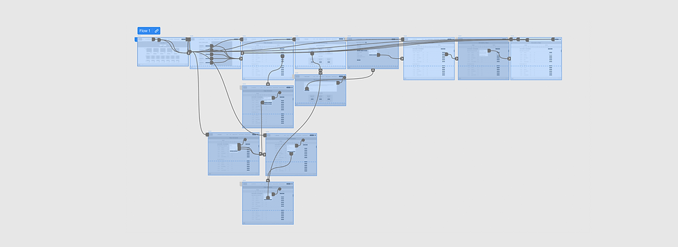
Difficulty with website navigation was a primary pain point for users, so I used that knowledge to create a sitemap.
My goal here was to make strategic information architecture decisions that would improve overall website navigation. The structure I chose was designed to make basic user scenarios as seamless as possible.


Paper Prototypes
I sketched out paper wireframes for the main screens of my website, keeping the user pain points user ease of use and access in mind.
Since this is a website people will be accessing on the go, on their smart phone devices, I started to work on designs for additional screen sizes to make sure the site would be fully responsive.

04
Digital Wireframes
Design, Prototype, Test
In the initial design phase, I made sure to base screen designs on feedback and findings from the user research. I kept the user's workflow and ease of use in an outdoor environment at the forefront of design ideations.


Round 1: Prototype and Test
I conducted two rounds of usability studies. Using the completed set of digital wireframes, I created a low-fidelity prototype. The primary user flow I connected involved scheduling a class, logging in, and adding money into the user's account for payment. Findings from the first study helped guide the designs from wireframes to mockups.
Study Type:
Participants:
Unmoderated
5 Participants

Round 1 : Test Findings
1
Locations
Additional information on locations was added.
2
Class Info
Modifications to class info were made for confusion clarification.
3
Account
An additional way to change payment info was added.
05
High Fidelity Designs
Branding


Design System
The beginnings of a design system were created to outline the styles, iconography, form and button design, and color palette choices.

Key Mockups
Early designs allowed for some customization, but after the usability studies, I added additional overlays to help users view less on each page and only make decisions on small visual tasks.


Round 2: Prototype and Test
The high fidelity prototype followed the same user flow as the wireframe prototype and included the design changes made after the usability study, as well as several changes suggested by user. The second usability study revealed overall user satisfaction with both design and function.
Study Type:
Participants:
Unmoderated
5 Participants
