COON

The Oasis
Poolside Sundry Ordering Tool
Good design makes life easy and that is the primary aim of this native mobile app. The Oasis poolside restaurant and bar needed a product built with environment and function as the fundamental user requirement. This multi-location app lets your user's fingers walk them and their families to all the tropical treats they desire right from their phones. It gives them all the tools they need to leave frustration behind as they navigate menus, orders, delivery, payment, and accounts all from a lounge chair, under sunlight glare - even if they left their purse or wallet upstairs.

Empathize • Define • Ideate • Prototype • Test

01
Project Overview
The Oasis poolside bar and restaurant needs a mobile app for its Vacation Resort Company. A wide variety of vacationers visit the hotel's pool and bar facilities as well as locals who pay for membership or day passes. Teenagers, young adults, families and local retirees utilize The Oasis for its fun tropical atmosphere, lively pool and lazy river, and cocktails and food.
Project Duration:
July 2022 to September 2022
Role:
UX & Product Designer
Platform:
Mobile App
Tools:
Adobe CC (Ps, Ai, Ru)
Figma
The Problem:
Vacation and purchasing shouldn’t be filled with lines, work, stress and confusion when you want something.
The Goal:
Design an app for The Oasis that allows users to easily select, order, and pay for food and drinks outside by the pool.
02
Empathize and Define
I conducted interviews and journey maps to discover the user’s needs, expectations, and end goals. Several user groups were identified. Comfort level with technology, expectations of ease and benefit, and repeat users versus short term visitors were some of the barriers that helped define categories.
Research also revealed a need for easy account set up, different levels of willingness to consider using the app depending on perceived benefit, and a high level of concern about viewability due to the outdoor venue as well as wide ranging age and vision capabilities.
User Group 1:
Working adults on vacation who will be interacting with the hotel poolside snack bar app on a temporary basis.
These users:
-
Tend to be younger and familiar with technology; understand apps of this nature and have preset expectations.
-
Have a busy career and are interested in making sure their recreation time is as relaxed, streamlined and as hassle free as possible.
-
Would use an app to place orders to avoid lines and ensure a high-end experience.


User Group 2:

Older adults who may have some hesitation with technology. These customers may be locals who have pool memberships as well and although not tech savvy, interested in streamlining their repetitive visits.
These users:
-
Tend to be residents in the area or older users that are not as comfortable with technology.
-
Vary in age, occupation, and number of family members in their home. They tend to have a more relaxed lifestyle and may be more focused on family.
-
Would like an app that does not demand a rapid rate of understanding and that caters to readers, outdoor glare, and people with failing eyesight.

Research Insights
Pain Points
1
Ease of Use
Users are on vacation and want stress free easy to use functionality.
2
Accessibility
The outdoor venue (glare) and wide range of age group users require readers or ability to increase text size.
3
Variety of Users
A vast difference in age groups and technology comfort levels create vastly different needs for the same product.
4
Account Setup
Setup must be easy since this is a proprietary location with limited use for guests.
03
Ideate

User Flows
Outlining each step in the user's process put a focus on how the user could accomplish tasks as efficiently as possible.
Paper Prototypes

Organizing and testing ideas in paper draft iterations for each screen of the app helped to ensure each of the elements were well suited to address any user pain points.
04
Digital Wireframes
Design, Prototype, Test
In the initial design phase, I made sure to base screen designs on feedback and findings from the user research. I kept the user's workflow and ease of use in an outdoor environment at the forefront of design ideations.


Round 1: Prototype and Test
I conducted two rounds of usability studies. Using the completed set of digital wireframes, I created a low-fidelity prototype. The primary user flow I connected was logging in and ordering food, so the prototype could be used in a usability study. Findings from the first study helped guide the designs from wireframes to mockups.

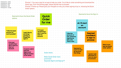
Round 1 : Test Findings
1
Group Ordering
The concept of sharing an order with a group was a confusing concept for users.
2
Time and Date
Users wanted default settings to pop up to reduce overhead of changing info.
3
Variety of Users
More user friendly functionality was needed in sign up process.
05
High Fidelity Designs
Branding


Key Mockups
Early designs allowed for some customization, but after the usability studies, I added additional overlays to help users view less on each page and only make decisions on small visual tasks.


Round 2: Prototype and Test
The final high fidelity prototype presented cleaner user flows for ordering and checkout. It also met user needs for group ordering. The second usability study revealed frustration with the action verbiage on buttons and what step users were on as they passed through the checkout process.